I love the idea of putting unexpected things together. I have a friend in Chicago who wallpapered her small bathroom with New Yorker covers. What an impact that made in that small bathroom. In my next home, I would like to dedicated one wall to personal items. I would love for the wall to include everything from maps of our favorite places to ticket stubs from our favorite shows or concerts. I'd include lyrics and maybe even favorite jokes or quotes that make our family laugh. Oooo, what about throwing in an old vinyl record you love or hang some jewelry and an old favorite toy in between the frames. I'm not sure how I'll put it together: symmetrically or all in the same color frame. I simply want this wall to have personal impact for our family.
These photos are what got me going:
What I love about this display is that it's quirky and unexpected. The silhouettes appear to be people in ski masks. You could reinterpret this with silhouettes of each family, member including your pets. Or you could do something unexpected like family members sticking their tongues out and holding up bunny ears. Also, notice the wall through the door. I don't know what the photos are but I love that they are displayed in the same frame and hung perfectly symmetrical. [source - the Contemporist]
Here is another room with a symmetrical display. I love how linear the display is and how it reflects the furniture below. [source - desire to inspire]

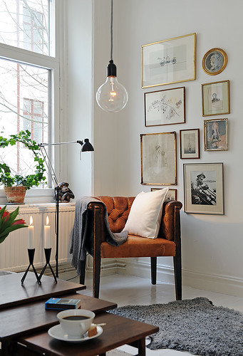
If you look at this collection, the frames and art are all different from each other. There are photos, drawings, paintings. The collection has a vintage feel to it. I love that the photos are displayed vertically and highlights the corner and chair. The frames are also hung randomly which gives the grouping a much more organic feel. [source - flickr, J.E.N.]
Here is another example of random silhouettes. I like that these plates frame the window and create a cozy space for the desk. This small space has a bigger impact as a whole vignette. [source - Apartment Therapy]
I love the simplicity of this display of the Beastie Boys' lyrics. Yes, I happen to love the Beastie Boys, but it really could be any song printed in the same font and color. How easy is this to do! [source - JAZZIMCG]
I've tried to put together interesting groupings of wall art in my house, but they don't seem to have the same impact to me. Partly because I haven't had the chance to add to them as I've wanted.
This is a black and white collection of family photos in my hallway. The problem with this wall is that it is in a major traffic area by the boys' bedrooms. Many a time have frames been knocked down. It is also near the landing of the staircase, so you don't have room to stand back and appreciate the collection as a whole. It is still special, however, because its of some of my favorite family photos.
This is a collection I've stared in my bedroom above my beloved tansu (you can read more about it here). C had purchased these drawings of the boys for me from Tush Tush (read more here). I decided on white frames because our bedroom is a bit dark (I also have the tendency to buy everything in black). I added some photos of Sophie (who happens to be lurking in the corner of this photo...we see you, Sophie.) that I took. I had planned to add a picture of me and C, but now I think I need to add some framed text (lyrics and/or quotes).
Doesn't it make a difference adding more to the wall, even if it's through Photoshop?! If I finish this project, I'll be sure to share it with you. I'm awfully inspired to get on it now.


Ooh - that does look cool with the extra frames added! I TOO wanted to wallpaper a bathroom with new yorker covers! And when I was in college, I had a subscription for several years and actually SAVE those covers in a manila envelope! I stopped getting the New Yorker...and I have NO IDEA where that manila envelope is...did i throw it away? or is it still lurking in a box of pictures somewhere? I don't know! ;-)
ReplyDelete